


Insights
Contrarian Investing Using the AAII Sentiment Survey
Unlock the power of contrarian investing by leveraging the AAII Sentiment Survey. Learn how investor...

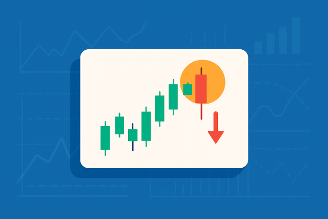
Hammer candle patterns are some of the most well-known and reliable formations in technical analysis for spotting potential trend reversals. These candlestick shapes give traders useful visual cues about shifts in market sentiment and often suggest that a downtrend might be ending while bullish momentum could be near. Recognizing and interpreting hammer candles can help traders of all levels anticipate price moves more effectively, manage risk like a pro and enter trades with greater confidence.
Candlestick charts are a staple in the trader’s toolbox offering a clear visual snapshot of price movement over specific periods. Hammer candles play a clever role in this setup by revealing subtle hints about market sentiment that go beyond price tags or volume
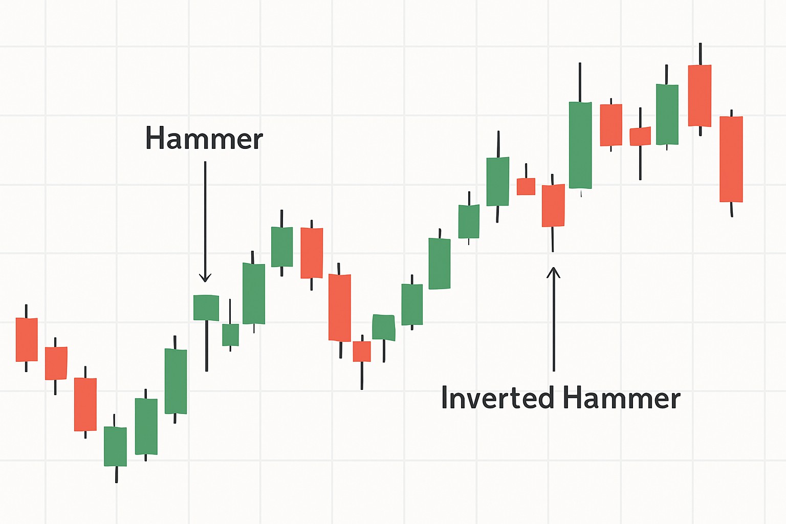
A hammer candle is a single candlestick characterized by a small real body sitting snugly near the top of its trading range, coupled with a long lower shadow.
Visual representation of a classic hammer candle demonstrating its unique shape on a candlestick chart.
Hammer candles come in a few different flavors like those with colored bodies in green or red but their standout feature remains the same: a small body perched atop a long lower wick that usually stretches at least twice the body’s length. It’s key to spot the hammer and not confuse it with similar patterns like the hanging man. The hanging man looks almost identical but appears after an uptrend and hints at a bearish reversal. The hammer usually signals a potential bullish reversal after a downtrend—kind of like a little glimmer of hope.
A hammer candle basically paints a picture of a tug of war between buyers and sellers during the trading period. That long lower shadow tells us sellers really tried to drag prices down, but buyers weren’t having any of it—they barged back in and pushed prices close to where they started by the close. This kind of pattern hints that the selling pressure in a downtrend is starting to loosen up, with buyers gradually stepping up to take the reins. The small body shows a bit of market hesitation or balance, but the obvious rejection of those lower prices is a hopeful little wink.
A hammer candle often looks like the market making a sharp dive only to quickly pull back, as if buyers suddenly found their footing and barged back in to push prices higher again.
Really spot hammer candles by taking a good close look at their shape and where they pop up on the chart. Also consider the bigger picture surrounding them. They typically show up after a clear downtrend. It is worth keeping an eye on the size of the body compared to the wick because that little detail often tells the whole story.
Hammer candles often hint at a potential bullish reversal after a downtrend and suggest buyers might be sneaking back onto the scene. On the flip side, the inverted hammer tends to signal a bearish reversal after an uptrend as if sellers are quietly gearing up.
| Feature | Hammer Candle | Inverted Hammer |
|---|---|---|
| Shape | Small body perched near the top with a long lower shadow that really catches the eye | Small body sitting close to the bottom, topped off with a long upper shadow that makes you stop and think |
| Position in Trend | Shows up right after a downtrend, like a little beacon of hope | Pops up after a downtrend or hangs around support levels, trying to get noticed |
| Interpretation | Usually hints at a potential bullish reversal, giving traders a bit of optimism | Might be waving a flag for a bullish reversal or simply advising a bit of caution |
| Volume Significance | Packs a stronger punch when volume is high, making the signal more trustworthy | Needs volume to be cranked up quite a bit before you can take it seriously |
| Confirmation Signals | Best friends with a confirming bullish candle that follows | Gets the green light once the price breaks above the hammer’s high, sealing the deal |
Hammer candles often hint at a possible reversal but I have found that waiting for confirming signals usually leads to more trustworthy trading outcomes. When the hammer day comes with higher volume followed by bullish candlesticks nudging the trend along and a thumbs-up from technical indicators, that is when the reversal story starts to feel much more convincing.
Keep an eye out for a noticeable spike in trading volume when that hammer candle appears. It is usually a strong sign that buyers are stepping into the ring.
Hold your horses until you see a bullish candle close above the hammer's high. That signals your green light to trust the pattern.
Double-check with technical indicators such as the RSI bouncing back from oversold levels or moving averages providing support.
Don’t forget to consider the bigger picture. Look at the overall trend and key support or resistance zones to make your decision more solid.
Watch carefully for a breakout above the hammer’s high. This often indicates the reversal has real strength behind it.
Hammer candles can be pretty handy tools yet they often get a bad rap or simply misunderstood. Traders sometimes put all their eggs in one basket expecting these patterns to shout out trend reversals all on their own without even glancing at what the price was up to beforehand.
Using hammer candle patterns as part of a complete trading strategy is like mixing the right ingredients for a perfect recipe. You’re blending pattern recognition with volume analysis, timing and solid risk management. Seasoned traders lean on these candles to guide their decisions on when to jump into or crawl out of trades and to pinpoint those all-important stop-loss levels.
Keep an eye out for a hammer candle after a clear downtrend. It’s often a small sign that strength might be returning.
Don’t just jump in. Wait for confirmation like higher volume and a bullish candle that follows the hammer.
Consider opening a long position once the price settles above the hammer candle’s high. This is a safer way to confirm the signal.
Make sure to place a stop-loss just below the hammer candle’s low to avoid big losses if the trade goes against you.
And hey, don’t rely on just one method. Use other tools like trend lines or moving averages to support your decisions and double-check any trend changes.
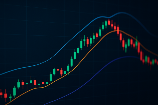
Traders often boost their odds of success by pairing hammer candle signals with trusty indicators like the Relative Strength Index (RSI) which highlights oversold conditions around those hammer patterns. Then there’s the Moving Average Convergence Divergence (MACD), a handy tool that helps confirm shifts in momentum and makes things feel more certain. Support and resistance levels aren’t just background noise. They play a starring role by helping to verify that the hammer lines up with key market areas.
Example chart showing hammer candle confirmed by RSI oversold bounce and MACD bullish crossover.

Tired of missing opportunities and making suboptimal trading decisions? TrendSpider's cutting-edge platform automates complex technical analysis, saving you time and reducing human error.
With multi-timeframe analysis, dynamic alerts, backtesting, and customizable charting, you'll gain a competitive edge in identifying trends and making informed trades across global markets.

16 posts written
Unlock the power of contrarian investing by leveraging the AAII Sentiment Survey. Learn how investor...

Learn the meaning of NFP in trading and why the monthly Non-Farm Payrolls report is a key economic i...
Discover how the DEM indicator offers a smoother, more responsive view of market trends. This guide...
Master the hanging man formation to spot potential bearish reversals confidently. This guide breaks...